Data visualization
Tools and platforms that visually present information and facilitate understanding of it, such as dashboards. See The Data Viz Catalog for a catalog of types of data visualizations.
Suggested reading:
- Better Data Visualizations. Over 500 examples and strategies for effective visual communication.
- The mySociety Access to Information network's data visualisation "Show and Tell"

Democratic Erosion Event Dataset (DEED)
The Democratic Erosion Event Dataset (DEED) records discrete events related to democratic erosion and autocratic consolidation across countries and over time.
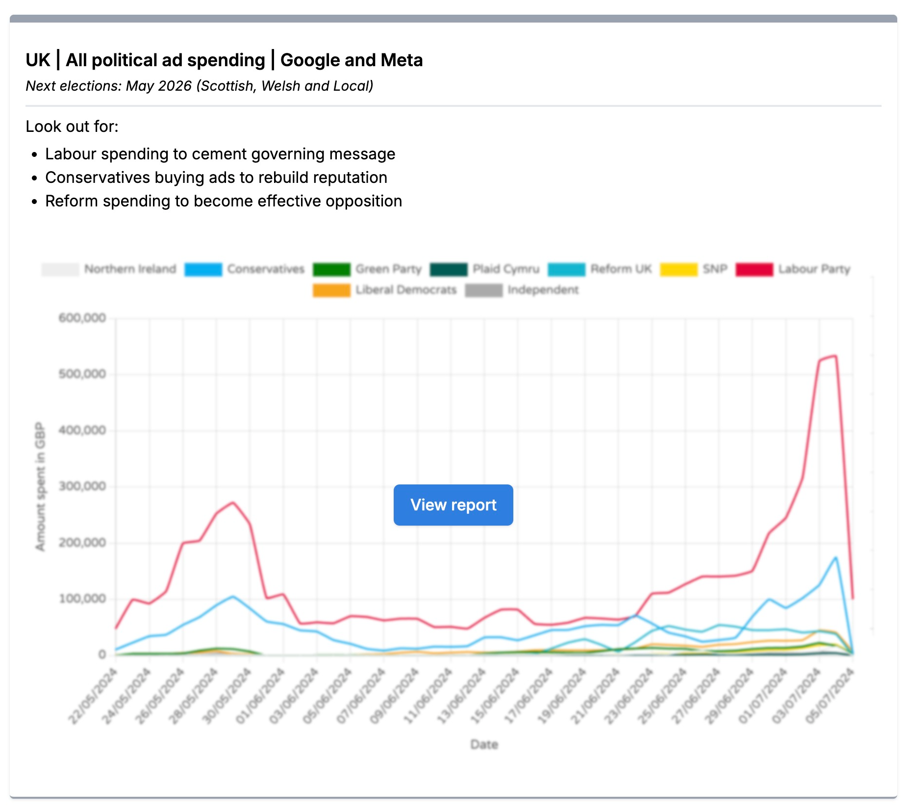
Trends (Who Targets Me)
Trends from Who Targets Me makes navigating and understanding digital political advertising data easier.
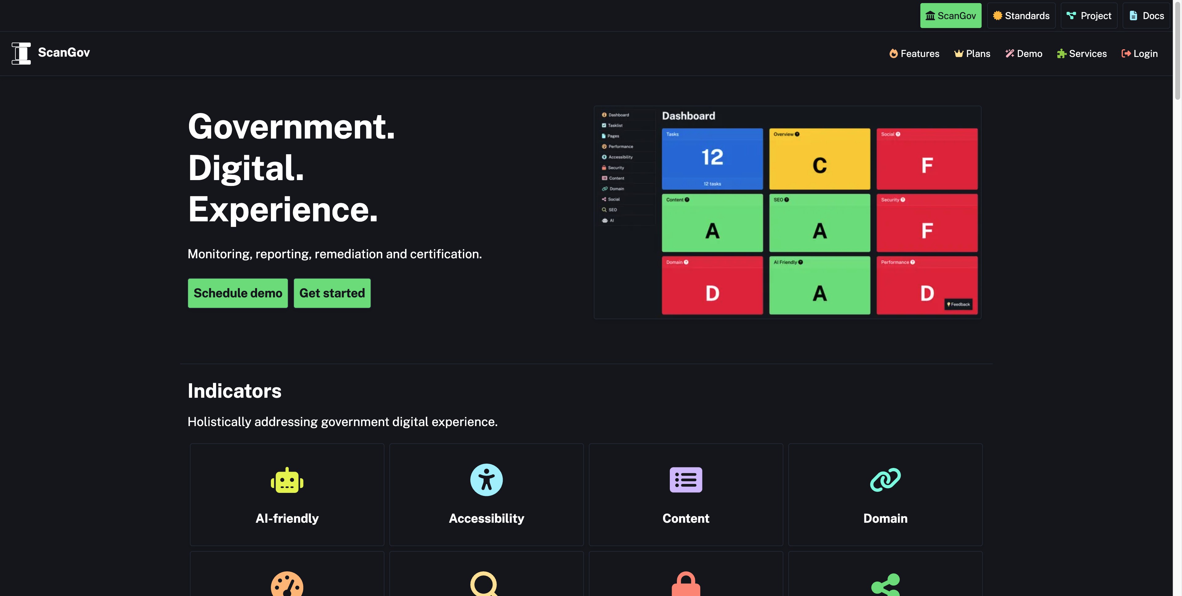
ScanGov
ScanGov is a government digital experience platform that helps public agencies monitor, improve, and maintain their websites. The service combines automated scanning with clear guidance to help govern...
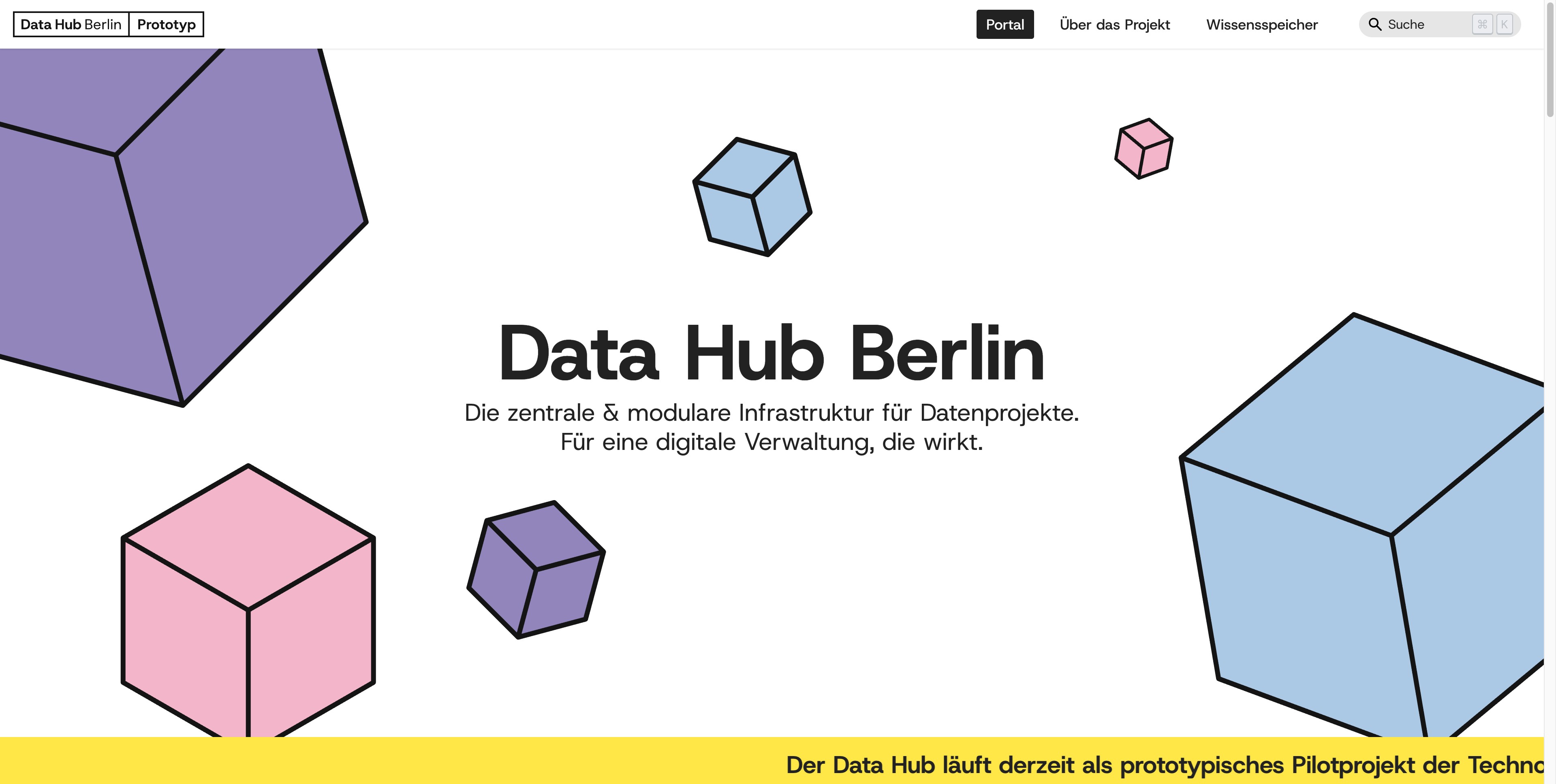
Data Hub Berlin Prototyp
Die zentrale & modulare Infrastruktur für Datenprojekte. Für eine digitale Verwaltung, die wirkt.
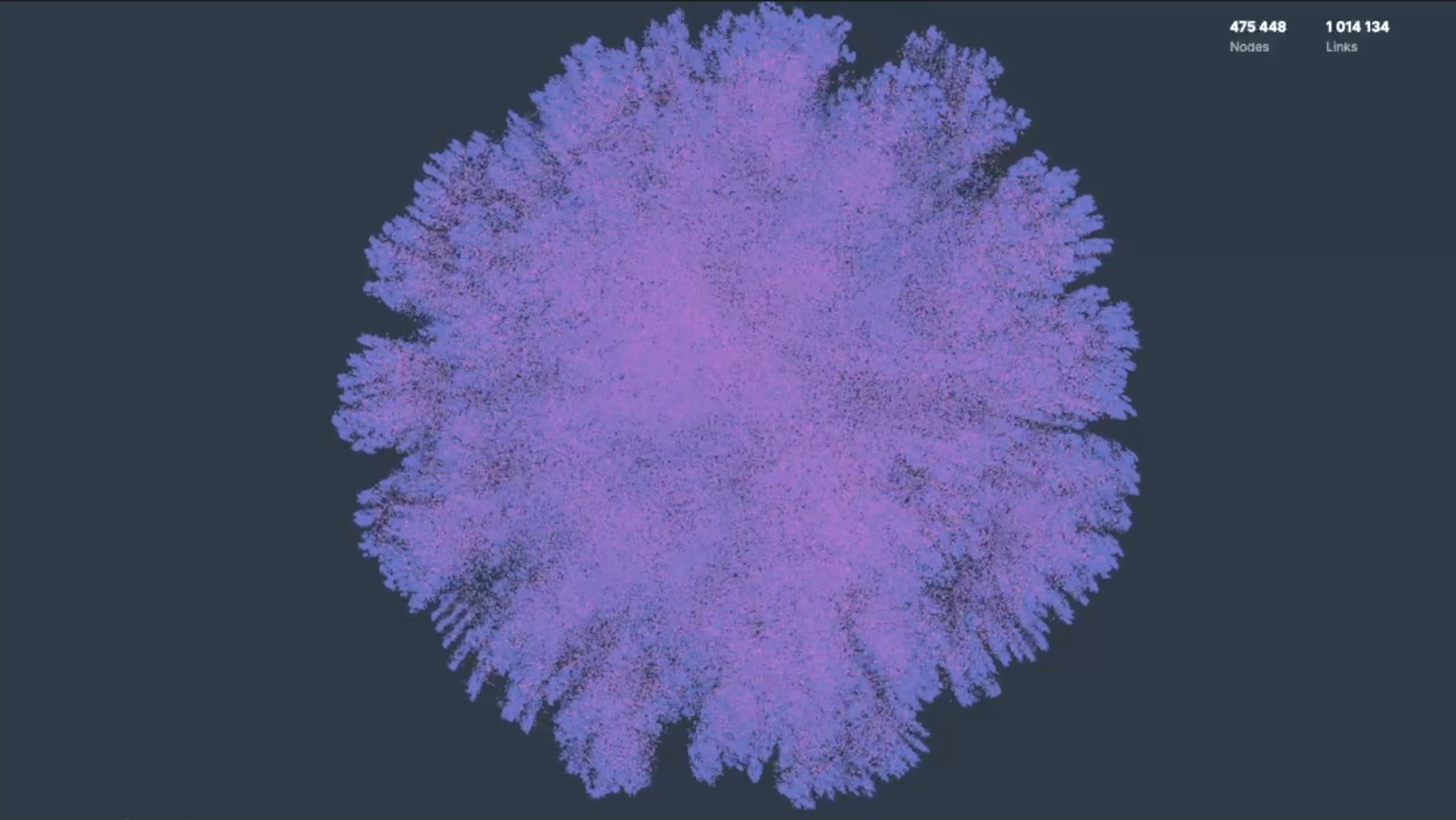
cosmos.gl
a high-performance WebGL library for visualizing network graphs and machine learning embeddings.
UK Petition Tracker
Real-time analytics platform for UK Parliament petitions, transforming official data into actionable insights for citizens and researchers.
Perspective Map Explorer
It's like Google Maps...But for navigating complex human perspectives.
Chalk
Transform complex content into accessible diagrams
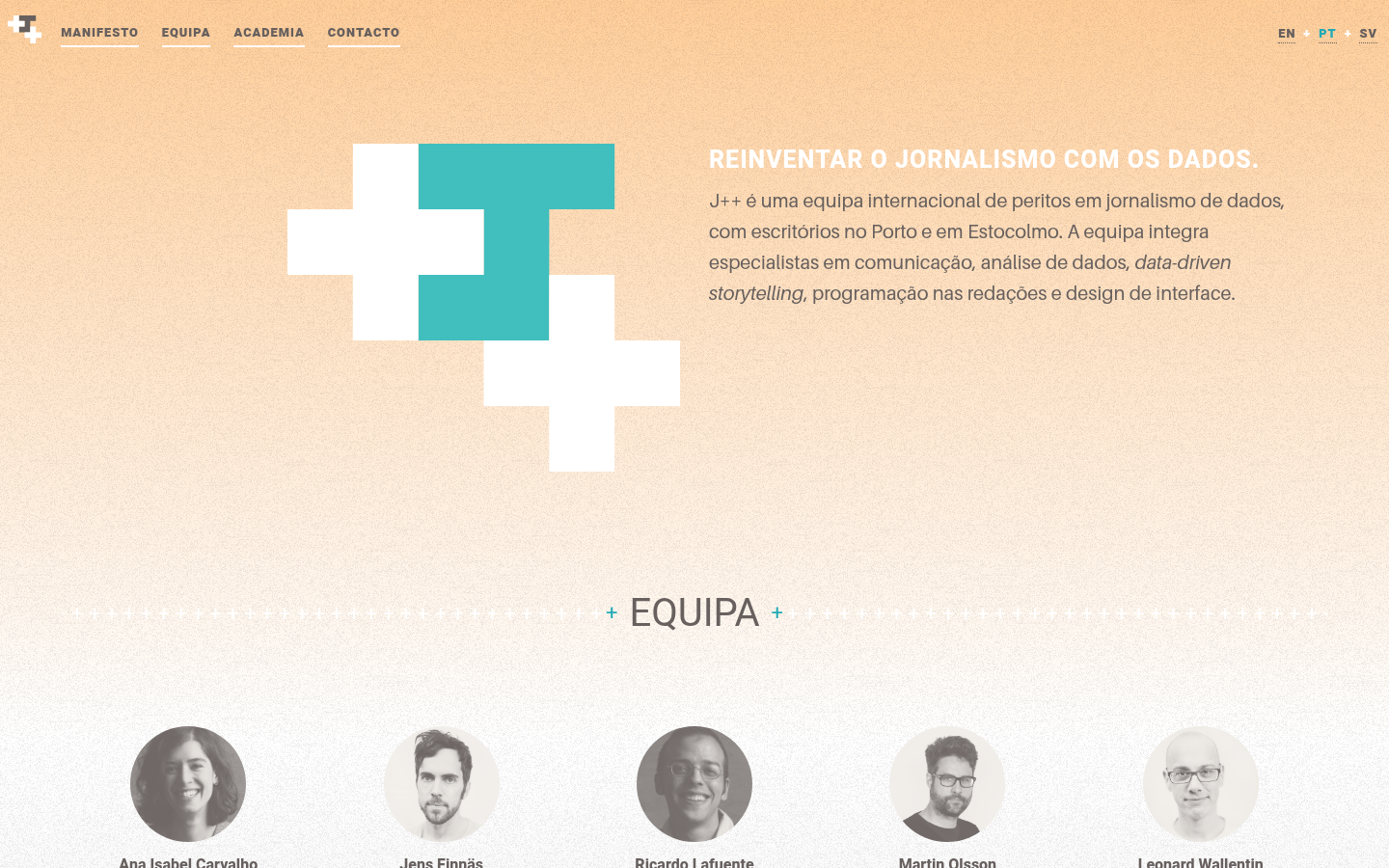
Journalism++ (J++)
J++ é uma equipa internacional de peritos em jornalismo de dados, com escritórios no Porto e em Estocolmo.
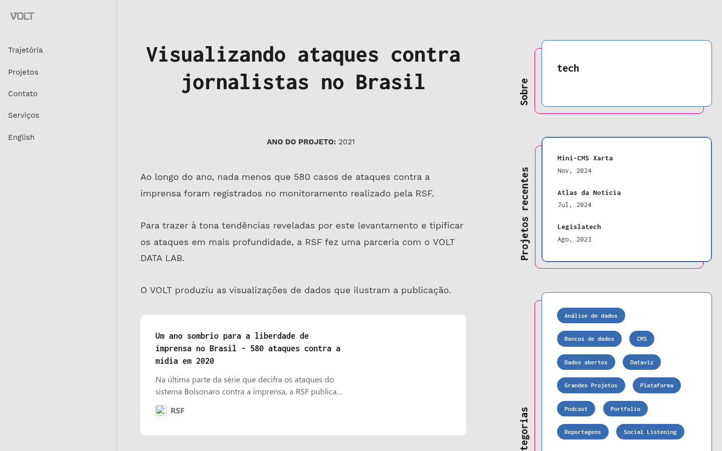
Visualizando ataques contra jornalistas no Brasil
Ao longo do ano, nada menos que 580 casos de ataques contra a imprensa foram registrados no monitoramento realizado pela RSF.

Reconstitution
Learn and compare Thailand's constitutions, presented through an interactive website, to enhance understanding of the constitution that everyone shares. | เรียนรู้และเปรียบเทียบรัฐธรรมนูญของประเทศไทย...

BKK Follow Up
A 12-year retrospective of problems that have bothered Bangkok residents | สำรวจปัญหากวนใจชาว กทม.

What Could BG Be
Engagement project with the city of Bowling Green, Kentucky

The Life and Times of Citibike #32606
806 days, 8,624 trips, 7,060 miles. Thank you for your service.

Capitol Riot Map
Mapping the networks of the 1,580 individuals who were arrested, charged, or convicted for participating on the attack on the U.S. Capitol on January 6, 2021.

Pardon Tracker
An independent investigative journalism and data visualization project, documenting the statements, activities, and networks of the individuals that received pardons or commutations for criminal charg...

datahacker
Mike Tahani's data viz gallery. It includes mapping, journalism, politics, outer space, and data visualization.

Storytelling with Data Course
Taught by Maria Massei-Rosato

Solar Protocol
This website is hosted across a network of solar powered servers and is sent to you from whichever server is in the most sunshine.

Melbourne Urban Forest Visual
People from around the world are sending emails to trees in Melbourne, expressing their love, admiration, and curiosity about the trees

Metabase
Providing an open‑source business intelligence and embedded analytics platform for creating dashboards, querying data, and embedding analytics.
Congestion Pricing Tracker
Curious whether Congestion Pricing is having an impact on commutes in NYC? Take a look to compare traffic data before and after Congestion Pricing

Neighborhood Explorer
Platform for tracking public data metrics for local governments and nonprofits.

Air Quality Stripes
Data visualization plots showing the changing trends in outdoor concentrations of particulate matter (PM2.5) air pollution from 1850 to 2021 in cities around the world

¿Cómo Crear Historia con Datos?
La herramienta para crear historia con datos del portal nacional de datos abiertos
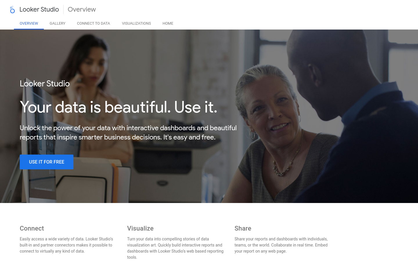
LookerStudio
Formerly Google Studio. Unlock the power of your data with interactive dashboards and beautiful reports that inspire smarter business decisions. It's easy and free.

Surveillance Watch
Surveillance Watch is an interactive map that documents the hidden connections within the opaque surveillance industry.

Domestic Data Streamers
We are a research and design studio partnering up with organisations to build change through data, community, and arts.

Congressional systems map
This map...illustrates a [Congress] in a state of dysfunction, with growing dissatisfaction on the part of the public, waning trust in its ability perform, and -- most significantly -- large-scale dis...

Querido Diário
Diários oficiais dos municípios brasileiros em formato aberto para a livre consulta da sociedade civil.
Data For Crisis
A collaborative work between DW Akademie and SocialLab to provide credible raw and aggregated data from Social Networks about crisis-related topics like COVID and Migration to support media practition...

Energy Profits
History-making profits. World-ending emissions.
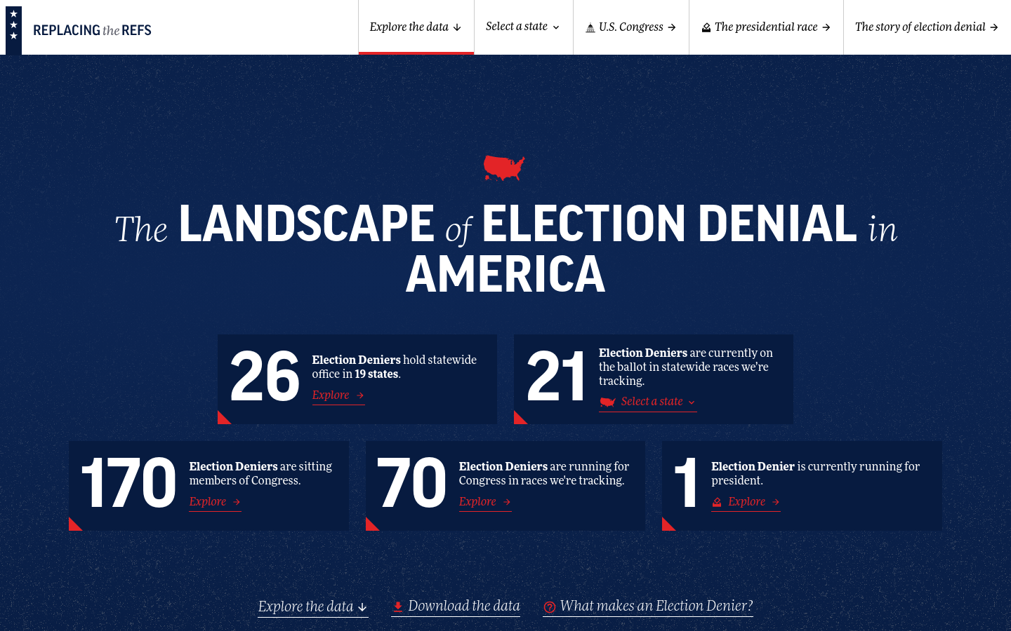
Replacing the Refs
The Landscape of Election Denial in America

An Analysis and Deep Dive Into New York City Subways
A Tableau data visualization and analysis of public transit in NYC

Spatial Equity NYC
Spatial Equity NYC (SE), a tool developed by MIT’s Norman B. Leventhal Center for Advanced Urbanism (LCAU) in close collaboration with New York City-based nonprofit Transportation Alternatives (TA), v...

CoreData.nyc
CoreData.nyc is New York City’s housing and neighborhoods data hub, presented by the NYU Furman Center.
NYC Funds Tracker
FPWA’s NYC Funds Tracker monitors New York City’s revenue and the flow to budget expenditures.

AQI to Cigarette
This reveals the equivalent cigarette intake based on Air Quality Index (AQI) and exposure time, offering a powerful wake-up call to the health impacts of poor air quality.

SHARE LAB
Research & Data Investigation Lab - Where indie data punk, meets media theory pop to investigate digital rights blues

7 Routes to Applied Behavioural Science Experimentation and Observation
A flowchart guide to help users consider which type(s) of experiments to run in policy settings

Social Explorer
Gain deep insights into any location of interest through thousands of data variables and stunning visualizations. Reinforce your decisions with Social Explorer’s reliable data mapping capabilities....

PUNCHUP
We create meaningful conversation with data + design + story.

Ruas do Género
An interactive data visualization project demonstrating the gender imbalance of street names in Porto

Digital Commons Lab
Digital Commons Lab (DCL) is a research laboratory of the Digital Society center of FBK with the goal to design, develop and analyze digital commons based on open data.

Police Scorecard
We analyzed data on 13,147 US police departments.

The Trevor Project: 2022 National Survey on LGBTQ Youth Mental Health
Data visualization nominated for 2023 Webby Award

Colorado Broadband Hub
The Colorado Broadband Office (CBO) leads the statewide effort to expand broadband coverage and quality for all Coloradans and coordinates all broadband efforts for Colorado.

MTA.ME
At www.mta.me, Conductor turns the New York subway system into an interactive string instrument.

UNDP Transparency Portal
Open database and map of recipients, donors

Counting India
Making Census Data Easy to Use